# button
按钮
# 属性
| 属性名 | 类型 | 必填 | 默认值 | 说明 |
|---|---|---|---|---|
| text | String | 否 | 无 | 按钮文案,优先级高于 slot 属性,注意:默认button内容为空 |
| size | String | 否 | auto | 按钮尺寸,可选值:auto、full、big、medium、small,注: auto 代表依据button内容撑开,如果父容器定义宽度,则继承父容器的宽度 |
| width | Number | 否 | 无 | 自定义按钮宽度,单位为 cpx,优先级高于 size 属性 注意:类型是 Number |
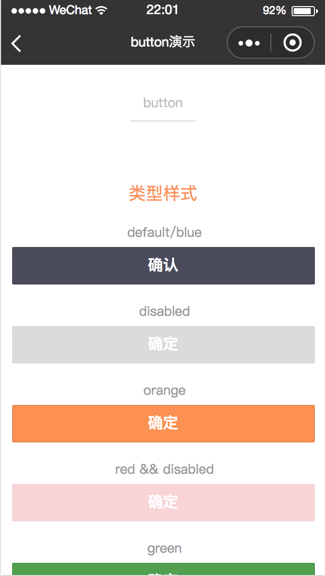
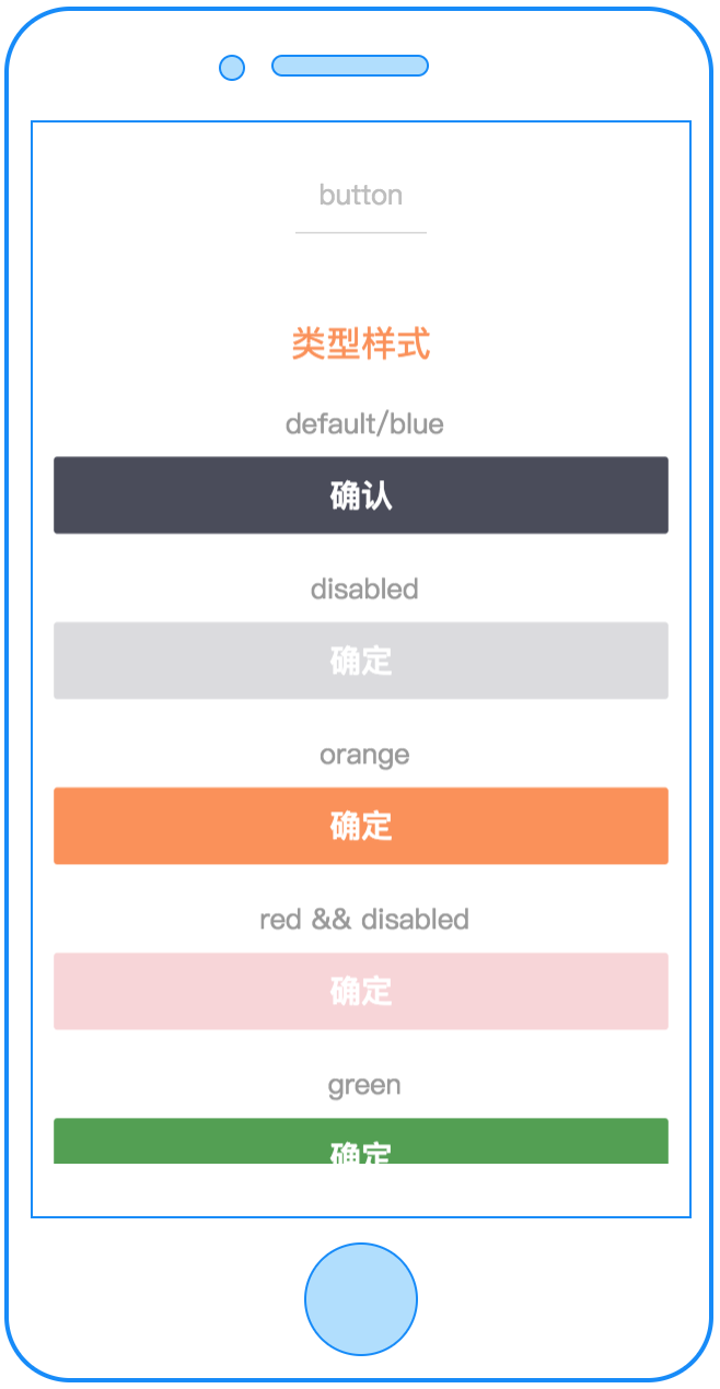
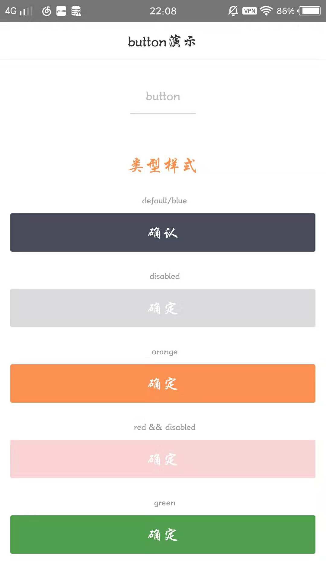
| type | String | 否 | "blue" | 按钮颜色,可选值:red、orange、blue、white、green |
| disabled | Boolean | 否 | false | 是否禁用 |
| btn-style | String | 否 | 自定义button的样式,如 "background-color:blue;height:100cpx;" | |
| text-style | String | 否 | 自定义按钮text的样式,如 "color:red;text-align:center;" | |
| disabled-style | String | 否 | 定义button disabled的样式,如 "background-color:grew;" | |
| text-style-disabled | String | 否 | 定义button disabled时text的样式,如 "color:white;" | |
| btn-hover-style | String | 否 | 指定按钮按下去的效果样式,如 "background-color:pink;" | |
| text-hover-style | String | 否 | 指定按钮按下去的text样式,如 "color:pink;" | |
| slot | 否 | 置于button里的插槽,可自由定义 | ||
| c-bind:onclick | EventHandle | 否 | button 点击事件
返回事件对象: event.type= "onclick" event.detail = { type, disabled } |
# 示例
<template>
  <button type="blue" text="确定" disabled="{{true}}" c-bind:onclick="testclick"></button>
</template>

<script>
import cml from 'chameleon-api';
class Button {
  methods = {
    testclick(e) {
      let type = e.detail.type;
      cml.showToast({
        message: type + ' button',
      });
    },
  };
}
export default new Button();
</script>
<script cml-type="json">
{
  "base": {}
}
</script>
← refresh-view input →