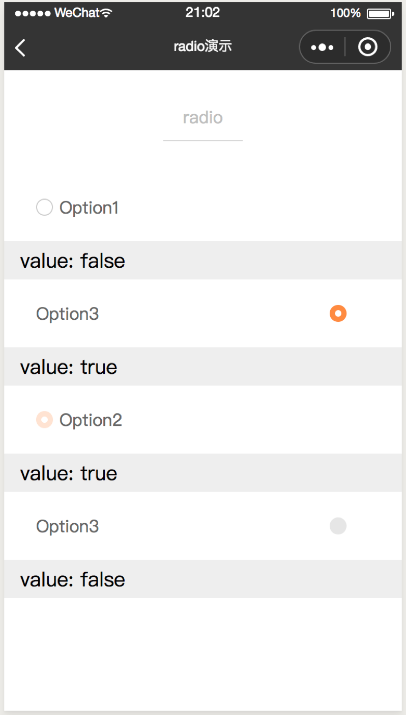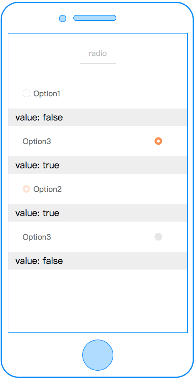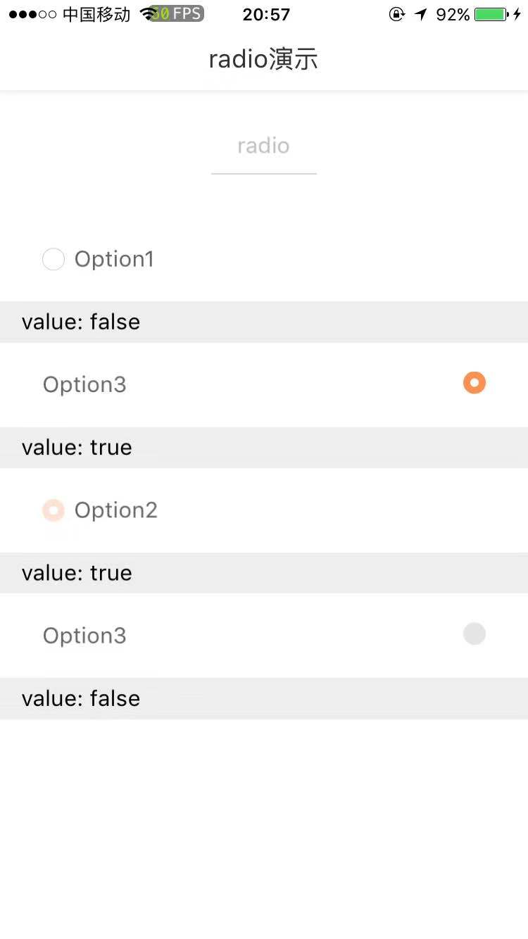
radio
单选框
属性
| 属性名 | 类型 | 必填 | 默认值 | 说明 |
|---|---|---|---|---|
| checked | Boolean | 否 | 关闭 | 是否开启 |
| label | String | 否 | 单选框文案 | |
| disabled | Boolean | 否 | false | 是否禁用 |
| position | String | 否 | left | 单选框相对于文案的位置,可选值包括:left、right |
| group-index | Number | 否 | -1 | 表示在radio-group中的索引 |
| cstyle | String | 否 | - | 自定义样式 |
| c-bind:change | EventHandle | 否 | 点击单选框触发
返回事件对象: event.detail 返回值: event.detail.value |
示例
<template>
  <radio
    checked="{{ radioValue }}"
    label="Option"
    c-bind:change="valueChange"
    >
  </radio>
</template>
<script>
class Index {
  data = {
    radioValue: false
  }
  methods = {
    valueChange (e) {
      this.radioValue = e.detail.value;
    }
  }
}
export default new Index();
</script>
<script cml-type="json">
{
  "base": {}
}
</script>