c-dialog
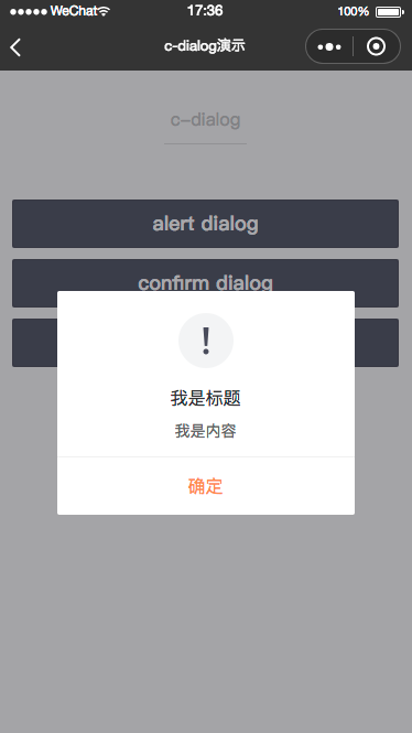
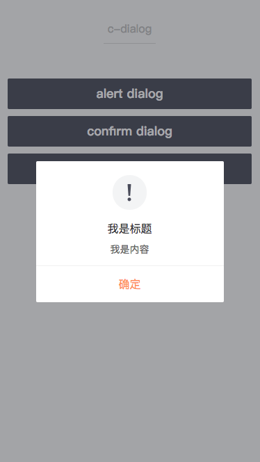
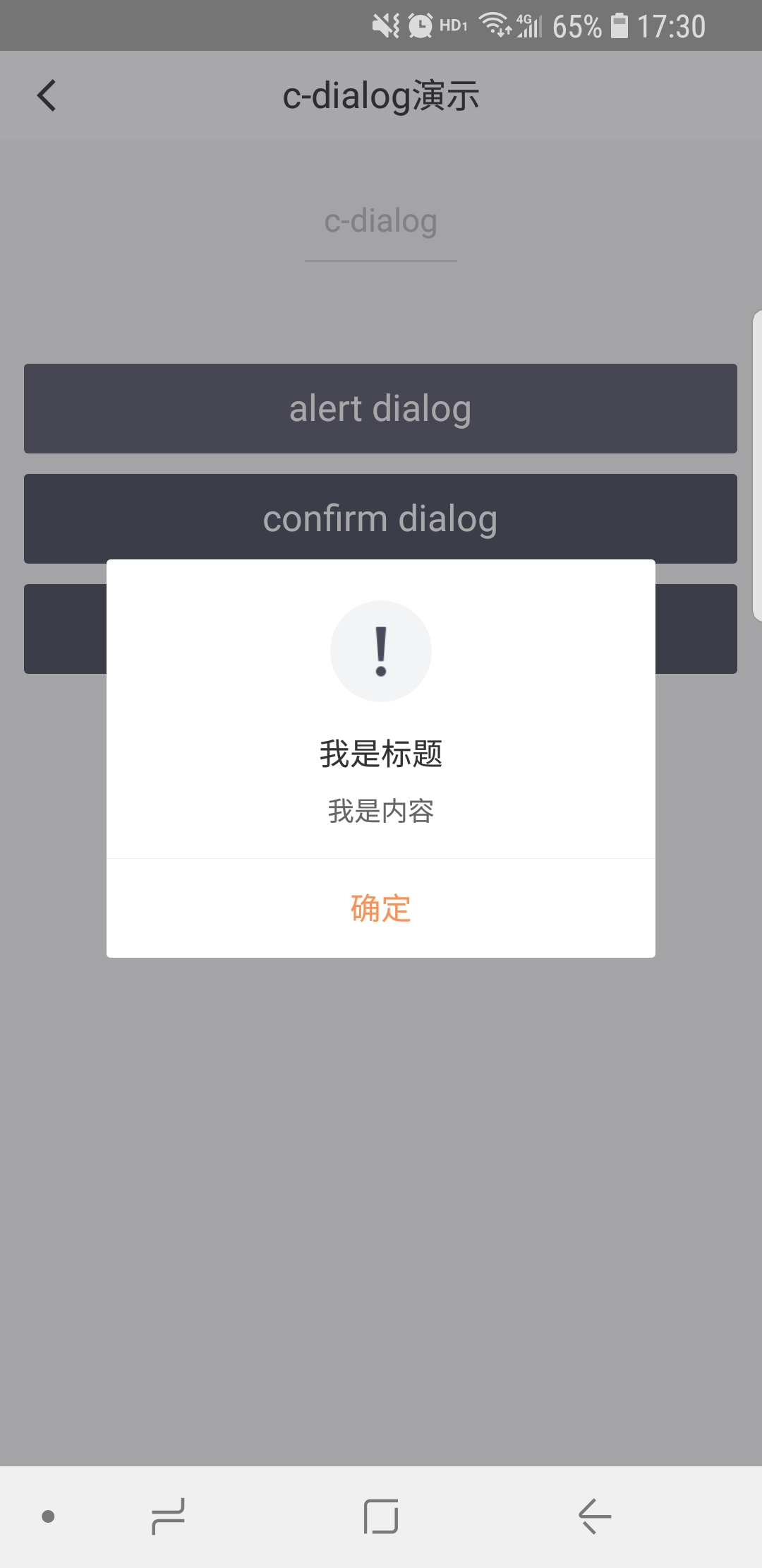
对话框
属性
| 属性名 | 类型 | 必填 | 默认值 | 说明 |
|---|---|---|---|---|
| title | String | 是 | 对话框提示的标题 | |
| content | String | 是 | 对话框提示的内容 | |
| type | String | 否 | alert | 对话框的类型,有效值:alert/confirm |
| cancel-text | String | 否 | “取消” | 取消按钮的文字 |
| cancel-style | Object | 否 |
自定义取消按钮的文案样式 如 {'color':'red','text-align':'center'} |
|
| confirm-text | String | 否 | “确定” | 确认按钮的文字 |
| confirm-style | Object | 否 |
自定义确认按钮的文案样式 如 {'color':'red','text-align':'center'} |
|
| icon-type | String | 否 | “warn” | 图标,有效值success/warn |
| icon-url | String | 否 | 图标地址 | |
| icon-style | Object | 否 | 图标的样式 | |
| mask | Boolean | 否 | true | 是否显示透明蒙层 |
| show | Boolean | 否 | false | 开启打开alert类型对话框 |
| show-close | Boolean | 否 | false | 是否显示close关闭图标 |
| c-bind:show | EventHandle | 否 | 开启alert类型对话框时触发 返回事件对象: event.type="changeShow", e.detail={value} |
|
| c-bind:cancel | EventHandle | 否 | 用户点击cancel时触发 返回事件对象: event.type="cancelEvent" |
|
| c-bind:confirm | EventHandle | 否 | 用户点击confirm时触发 返回事件对象: event.type="confirmEvent" |
|
| c-bind:close | EventHandle | 否 | 点击close图标时触发 返回事件对象: event.type="closeEvent" |
示例
<template>
  <view class="toast-page">
    <c-dialog show="{{true}}"
              title="标题"
              mask="{{true}}"
              content="内容内容"
    >
    </c-dialog>
  </view>
</template>

<script>
class C_dialog   {
}

export default new C_dialog();
</script>

<script cml-type="json">
{
  "base": {
    "usingComponents": {
      "c-dialog": "cml-ui/components/c-dialog/c-dialog"
    }
  }
}
</script>