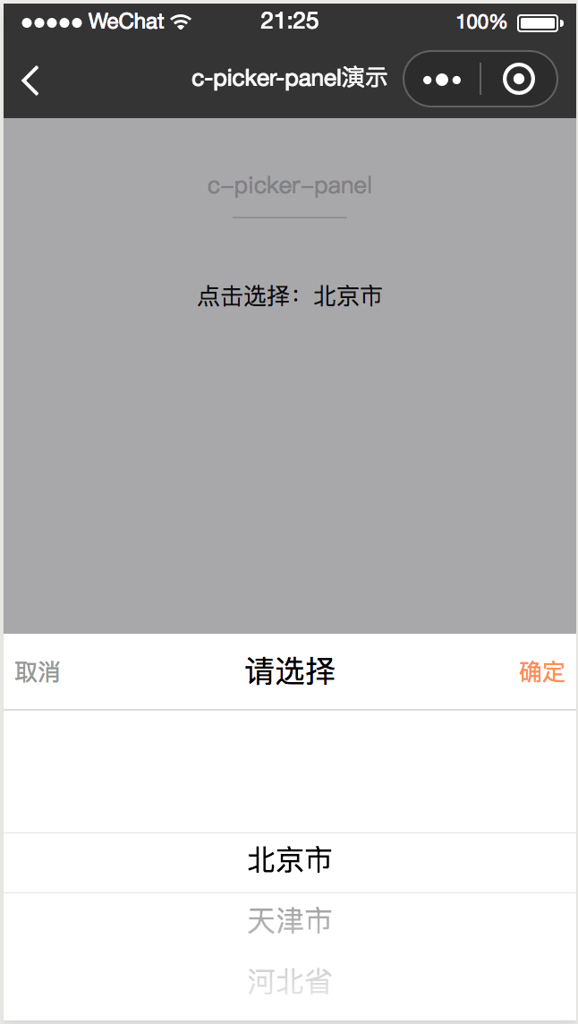
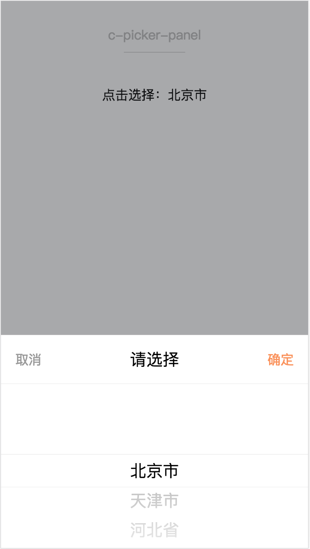
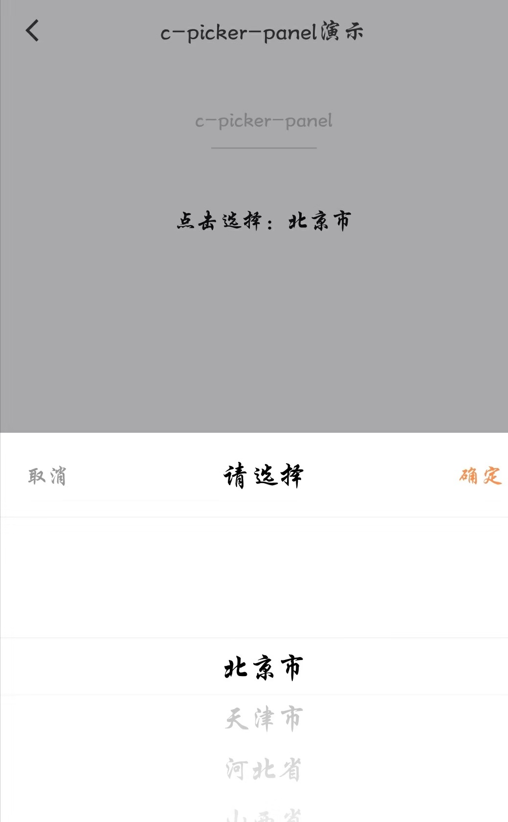
c-picker-panel
从底部弹起的控制板。
属性
| 属性名 | 类型 | 必填 | 默认值 | 说明 |
|---|---|---|---|---|
| show | Boolean | 是 | false | 是否点击打开底部控制板 |
| title | String | 否 | "请选择" | 控制板的标题 |
| header-height | Number | 是 | 100 | 底部控制板标题栏的高度 |
| cancel-btn-style | String | 否 | 自定义取消按钮的样式,如 "color:red;text-align:center;" | |
| confirm-btn-style | String | 否 | 自定义确定按钮的样式,如 "color:red;text-align:center;" | |
| c-bind:cancel | EventHandle | 否 | 用户点击"取消"时触发: 返回事件对象: event.type="cancel" |
|
| c-bind:confirm | EventHandle | 否 | 用户点击"确定"时触发: 返回事件对象: event.type="confirm" |
示例
c-picker-panel
<template>
<page title="c-picker-panel演示">
  <view class="container">
      <text class="select-text" c-bind:tap="showClick">点击选择:{{provins[provinsIndex]}}</text>
      <c-picker-panel
          c-if="{{panelShow}}"
          show="{{panelShow}}"
          height="{{500}}"
          header-height="{{100}}"
          c-bind:cancel="cancel"
          c-bind:confirm="confirm">
              <c-picker-item
                  text-align="center"
                  height="{{400}}"
                  list="{{provins}}"
                  default-index="{{defaultIndex}}"
                  c-bind:selectchange="selectchange">
              </c-picker-item>
      </c-picker-panel>
  </view>
</page>
</template>
<script>
import { provins } from "./data";
class CPickerPanel {
  data = {
    provins: [
      "北京市",
      "天津市",
      "河北省",
      "山西省",
      "内蒙古",
      "辽宁省",
      "吉林省",
      "黑龙江省",
      "上海市",
      "江苏省",
      "浙江省",
      "安徽省",
      "福建省",
      "江西省",
      "山东省",
      "河南省",
      "湖北省",
      "湖南省",
      "广东省",
      "广西",
      "海南省",
      "重庆市",
      "四川省",
      "贵州省",
      "云南省",
      "西藏",
      "陕西省",
      "甘肃省",
      "青海",
      "宁夏",
      "新疆"
    ],
    defaultIndex: 0,
    provinsIndex: 0,
    panelShow: false
  }

  computed = {}
  watch  = {}

  methods = {
    selectchange(e) {
      this.provinsIndex = this.defaultIndex = e.detail.index;
    },
    showClick() {
      this.panelShow = true;
    },
    cancel() {
      this.panelShow = false;
    },
    confirm() {
      this.panelShow = false;
    }
  }

  beforeCreate() {}
  created() {}
  beforeMount() {}
  mounted() {}
  beforeDestroy() {}
  destroyed() {}
}

export default new CPickerPanel();
</script>
<style scoped>
.container {
  background: #f8f8f8;
  position: absolute;
  top: 88cpx;
  bottom: 0;
  left: 0;
  right: 0;
}
.page-demo {
  background: #fafafa;
  position: absolute;
  top: 0;
  bottom: 0;
  left: 0;
  right: 0;
}
.title-text {
  color: #999;
  margin: 30cpx 20cpx 10cpx;
  display: block;
  font-size: 28cpx;
}
.picker-item {
  background: #fff;
  border-top: 1px solid #d9d9d9;
  border-bottom: 1px solid #d9d9d9;
  display: flex;
  flex-direction: row;
}
.picker-text-left {
  font-size: 40cpx;
  height: 70cpx;
  line-height: 70cpx;
  margin-left: 20cpx;
  width: 300cpx;
}
.picker-text-right {
  font-size: 40cpx;
  height: 70cpx;
  line-height: 70cpx;
  margin-left: 20cpx;
  flex: 1;
  text-align: center;
}
.select-text {
  font-size: 32cpx;
  text-align: center;
  display: flex;
  justify-content: center;
  align-items: center;
}
</style>
<script cml-type="json">
{
    "base": {
        "usingComponents": {
            "c-picker-panel": "cml-ui/components/c-picker-panel/c-picker-panel",
            "c-picker-item": "cml-ui/components/c-picker-item/c-picker-item"
        }
    }
}
</script>
Bug & Tip
1.使用c-picker-panel组件时控制显示隐藏需要在该组件上添加c-if指令,保证隐藏时该节点被销毁,否则会导致微信小程序错误。