col
纵向flex布局容器
与<row> 组件结合使用,可快速构建整洁干净的flex布局。
属性
| 属性名 | 类型 | 必填 | 默认值 | 说明 |
|---|---|---|---|---|
| width | Number | 否 | 0 | 容器宽度,值为0时容器宽度由内部元素宽度决定 |
| height | Number | 否 | 0 | 容器高度,值为0时容器高度由内部元素高度决定 |
| background-color | String | 否 | 容器背景色 | |
| margin | Number | 否 | 0 | 容器左右间隔(单位cpx) |
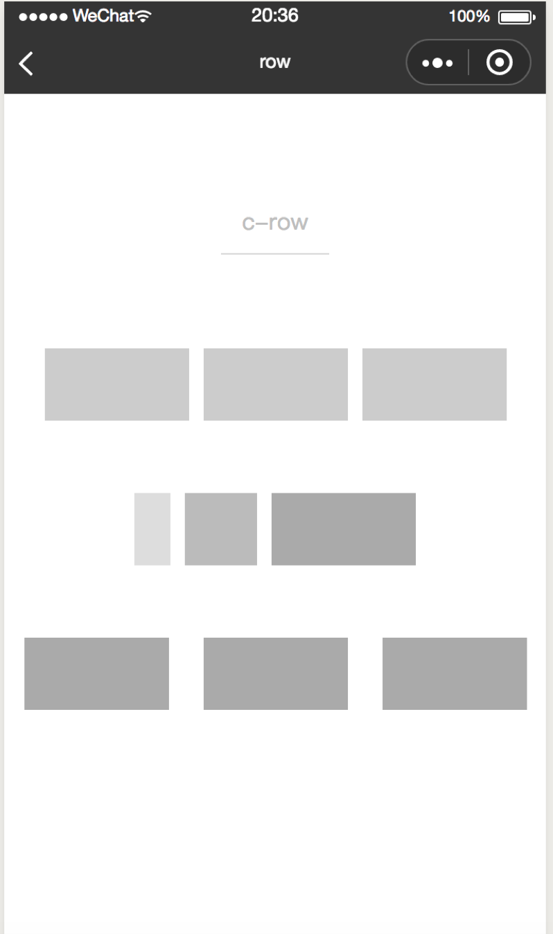
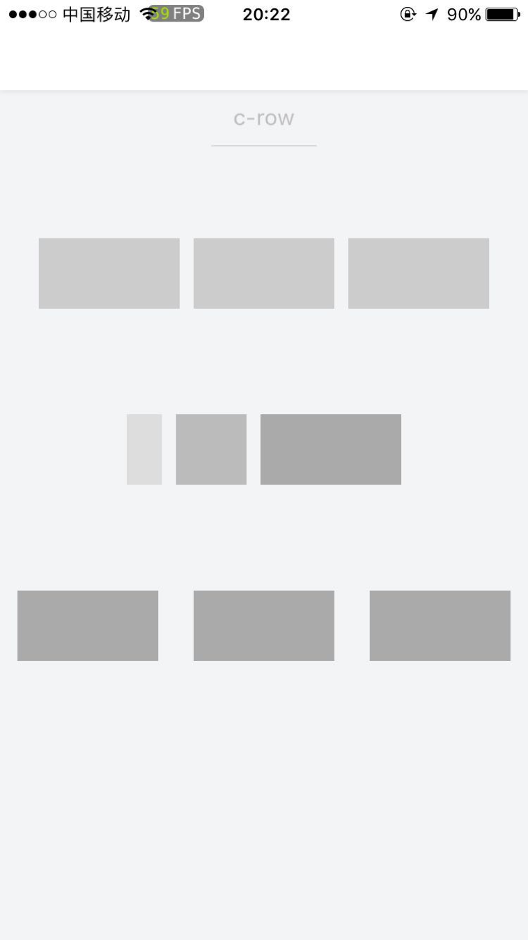
示例
<template>
  <row margin="{{100}}" height="{{100}}">
    <col margin="{{50}}">
      <view class="col-item"></view>
    </col>
    <col margin="{{50}}">
      <view class="col-item"></view>
    </col>
    <col margin="{{50}}">
      <view class="col-item"></view>
    </col>
  </row>
</template>
<script>

class Col  {
}
export default new Col();
</script>
<style scoped>
.col-item {
  background: #aaa;
  width:200cpx;
  height:100cpx;
}
</style>
<script cml-type="json">
{
  "base": {}
}
</script>