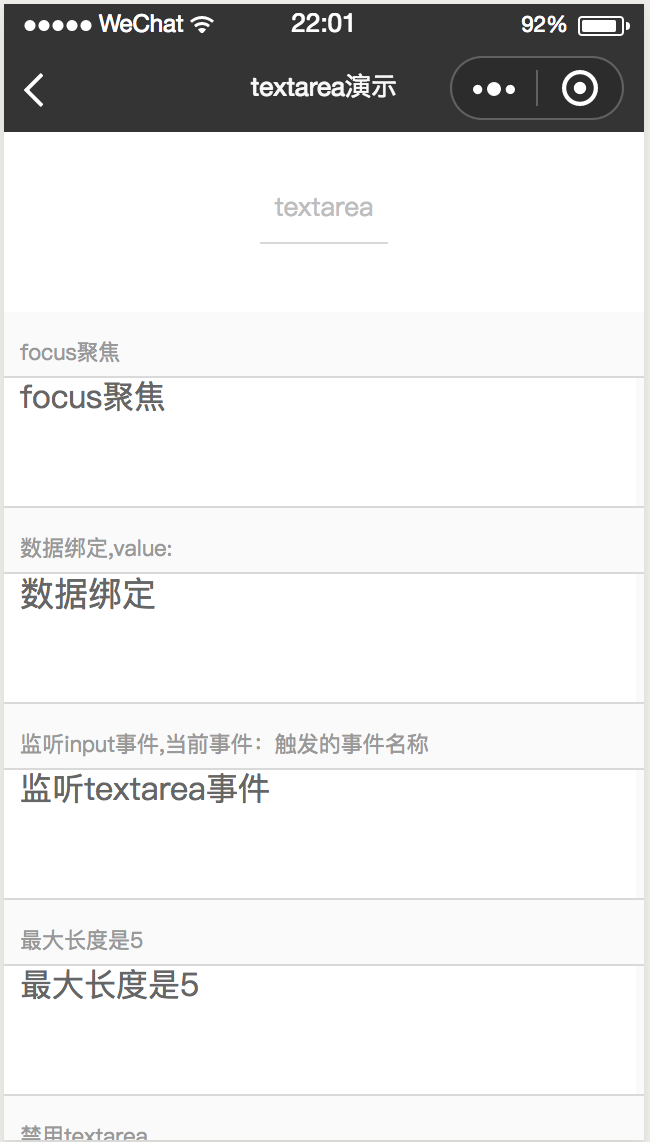
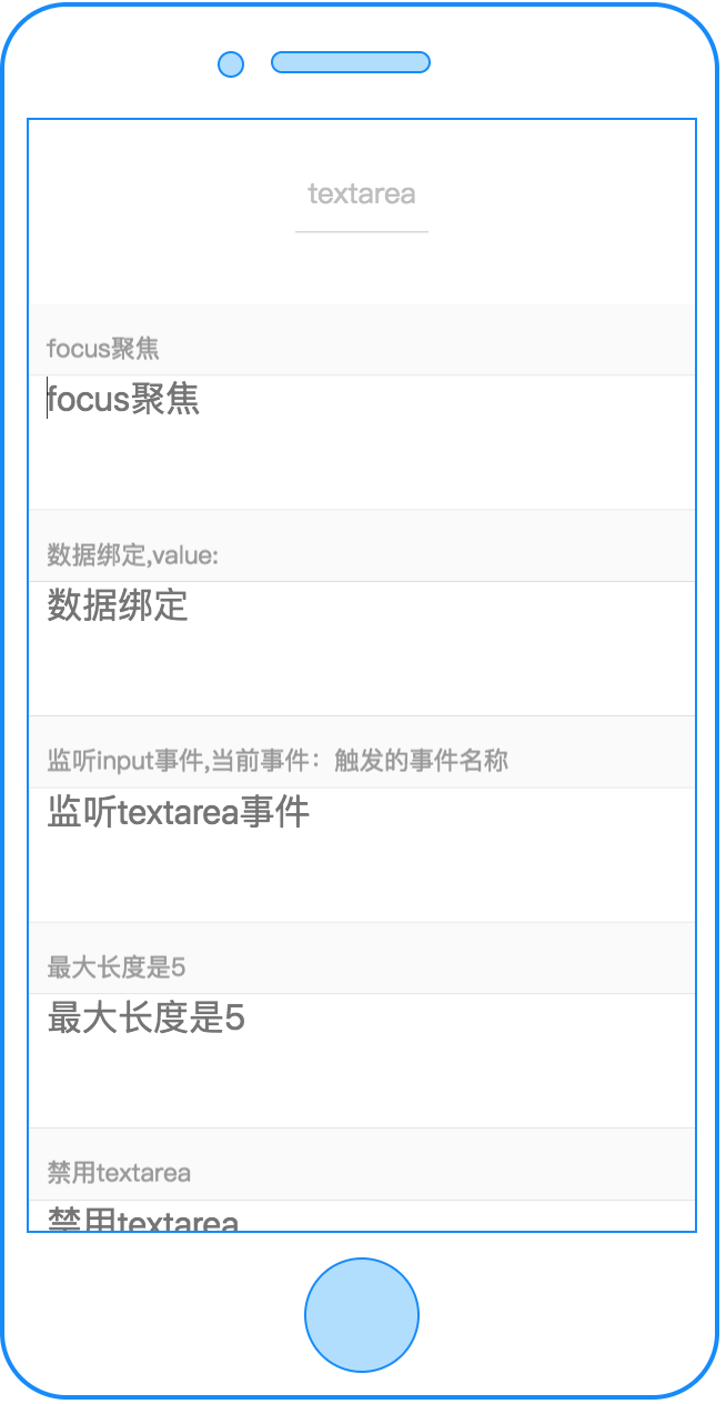
textarea
多行输入框
属性
| 属性名 | 类型 | 必填 | 默认值 | 说明 |
|---|---|---|---|---|
| cstyle | String | 否 | 自定义样式,如 "color:red;text-align:center;" | |
| value | String | 否 | 多行输入框的初始内容 | |
| type | String | 否 | "text" | 多行输入框的类型 |
| placeholder | String | 否 | 提示用户输入的内容 | |
| disabled | Boolean | 否 | false | 是否禁用 |
| focus | Boolean | 否 | false | 获取焦点(web端不支持) |
| maxlength | Number | 否 | 140 | 最大输入长度 |
| return-key-type | String | 否 | "done" | 设置键盘右下角按钮的文字(web端不支持) |
| placer-holder-color | String | 否 | “#666” | 指定placeholder的颜色(web端不支持) |
| rows | Number | 否 | 2 | text-area行数,weex、web端生效 |
| c-bind:input | EventHandle | 否 | 键盘输入时触发
返回事件对象: event.type="input", event.detail={value} |
|
| c-bind:confirm | EventHandle | 否 | 点击完成按钮时触发
返回事件对象: event.type="confirm", event.detail |
|
| c-bind:focus | EventHandle | 否 | 输入框获取焦点时触发
返回事件对象: event.type="focus", event.detail |
|
| c-bind:blur | EventHandle | 否 | 输入框失去焦点时触发
返回事件对象: event.type="blur", event.detail |
type 的有效值:
| 值 | 说明 |
|---|---|
| text | 文本类型的输入 |
| password | 密码类型的输入 |
| number | 数字类型的输入 |
return-key-type 的有效值:
| 值 | 说明 |
|---|---|
| done | 右下角按钮为“完成” |
| search | 右下角按钮为“搜索” |
| next | 右下角按钮为“下一个” |
| go | 右下角按钮为“前往” |
示例
<template>
     <textarea placeholder="focus聚焦" focus="{{isfocus}}"  c-bind:blur="bindblurevent"></textarea>
</template>

<script>
class Textarea {
  data = {
    isfocus: false
  }
  methods = {
    bindblurevent()  {
      console.log('blur')
      this.isfocus = false;
    }
  }
  mounted = function(res) {
    setTimeout(() => {
        this.isfocus = true;
    }, 300);
  }
};
export default new Textarea();
</script>
<script cml-type="json">
{
  "base": {}
}
</script>
Bug & Tip
<textarea>wx端不能包裹在<scroller>里面<textarea>web端不支持自动focus<textarea>return-key-type字段web端不支持