c-tabbar
tabbar组件
注意需要升级最新的cml-ui,在项目根目录执行npm i cml-ui@latest -S
属性
| 属性名 | 类型 | 必填 | 默认值 | 说明 |
|---|---|---|---|---|
| c-bind:onclick | EventHandle | 是 | tab被点击的时候会触发该事件,参数详情中`detail.compName`是tabbar.list配置中的compName | |
| c-model | String | 是 | 当 使用 component 动态组件的时候,更方便的和动态组件要渲染的组件名有个对应,具体使用方式参考下面案例中的 currentComp | |
| tabbar | Object | 是 | {} | 详情见下表 |
tabbar 详情
| 属性名 | 类型 | 必填 | 默认值 | 说明 |
|---|---|---|---|---|
| useFixedLayout | Boolean | 否 | false | 用于决定是否使用position:fixed 这种布局方式去布局tabbar组件 |
| position | String | 否 | 'bottom' | 仅在useFixedLayout 为true的时候生效 |
| tabbarStyle | String | 否 | '' | tabbar样式支持自定义 |
| tabLineStyle | String | 否 | 'background-color:#FC9153;height:2cpx;' | tabbar的下划线自定义样式,仅在 position 设置为top的时候有效 |
| textStyle | String | 否 | 'color:#000000' | tabbar文案默认的样式 |
| selectedTextStyle | String | 否 | 'color:#61c7fc' | tabbar文案被选中的时候的样式 |
| list | Array | 是 | [] | 配置tabbar的icon,文案等,详情见下表 |
list 中数组每一项的配置详情
| 属性名 | 类型 | 必填 | 默认值 | 说明 |
|---|---|---|---|---|
| text | String | 是 | '' | tab的文案 |
| icon | 网络图片地址或者`require(path/to/image)` | 否 | tab的icon | |
| selectedIcon | 网络图片地址或者`require(path/to/image)` | 否 | tab被选中时显示的icon | |
| iconStyle | String | 否 | 默认的icon的宽高是40cpx; | 设置icon的样式 |
| selectedIconStyle | String | 否 | 设置icon被选中的时候的样式 | |
| compName | String | 是 | 选择'usingComponents'中的组件进行对应,需要结合component动态组件进行渲染 |
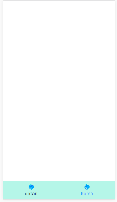
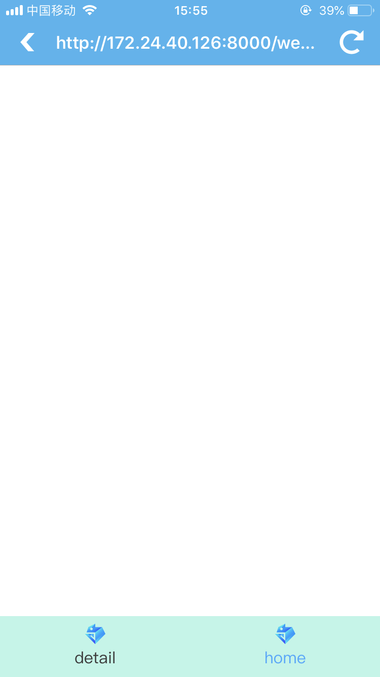
示例
<template>
<view>
  <view style="height:{{viewPortHeight}}cpx;background-color:#42f4f4" >
    <component is="{{currentComp}}" ></component>
  </view>
  <c-tabbar
    c-bind:onclick='handleTabbarClick'
    c-model="{{currentComp}}"
    tabbar="{{tabbar}}"
    ></c-tabbar>
</view>

</template>

<script>
import cml from "chameleon-api";
class Index   {

  data = {
    viewPortHeight:0,
    currentComp:'comp1',
    tabbar:{
      "tabbarStyle":"height:120cpx;background-color:#BAF6E8",//tabbar最外层的样式支持自定义
      "tabLineStyle":"background-color:#069ADC;height:2cpx;",//自定义tabline的高度和背景色
      "textStyle":"color:#3b3b3b", //文案默认style ,可以这里控制文案的大小,样式等
      "selectedTextStyle":"color:#3baaff",//文案被选择style
      // "position":"top", //tabbar的位置 top/bottom
      "useFixedLayout":true,  //是否通过fixed布局进行tabbar的布局
      "list":[
        {
          "compName":"comp1",
          "text": "detail",
          "icon": require("../../assets/images/chameleon.png"),
        },
        {
          "compName":"comp2",
          "text": "home",
          "icon": require("../../assets/images/chameleon.png"),
        }
      ]
    },
  }
  methods = {
    handleTabbarClick(args){
      console.log('tabbar-info',args)
    }
  }
  created(res){
    cml.getSystemInfo().then(info => {
    //这里要减去tabbar的高度,默认是120cpx,如果tabbarStyle中设置了其他高度,则要减去对应的值;
      this.viewPortHeight = Number(info.viewportHeight) - 120;
    });
    if(res.comp){ //这里可以在传递的query中获取到想要激活的组件,具体使用方式参见文末的demo链接
      this.currentComp = res.comp;
    }
  }
}

export default new Index();
</script>

<style>

</style>

<script cml-type="json">
{
  "base": {
    "usingComponents": {
      "c-tabbar":"cml-ui/components/c-tabbar/c-tabbar",
      "comp1":"/components/demo-com/comp1",
      "comp2":"/components/demo-com/comp2"
    }
  }
}
</script>