c-radio-group
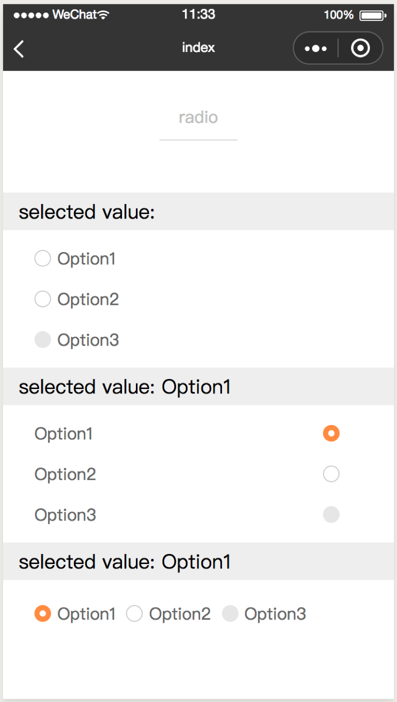
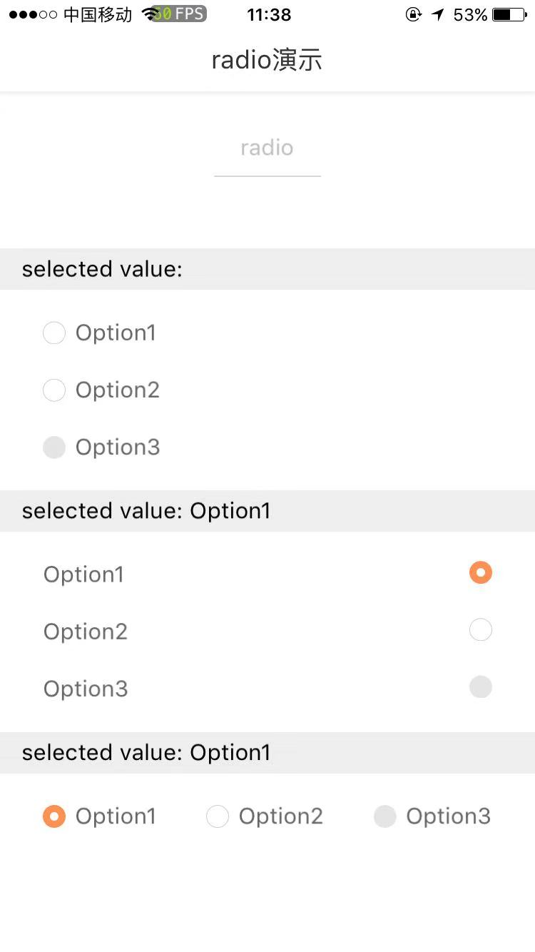
单选框列表
属性
| 属性名 | 类型 | 必填 | 默认值 | 说明 |
|---|---|---|---|---|
| option | Array | 是 | [] | 选项数组 |
| horizontal | Boolean | 否 | false | 单选框排列方向,默认纵向排列 |
| position | String | 否 | left | 按钮相对于文案的位置,可选值包括:left、right |
| color | String | 否 | - | 选中时颜色 |
| cstyle | String | 否 | - | 自定义样式 |
| itemStyle | String | 否 | - | radio自定义样式 |
| c-bind:groupchange | EventHandle | 否 | 点击按钮出发
返回事件对象: event.detail 返回值: event.detail.value - 修改后的选项数组 event.detail.index - 修改的单选框索引 |
示例
<template>
  <c-radio-group
    option="{{ radioGroupOption }}"
    c-bind:groupchange="groupChangeHandler"
    >
  </c-radio-group>
</template>
<script>
class CRadio {
  data = {
    radioGroupOption: [
      {
        checked: false,
        label: 'Option1',
      },
      {
        checked: false,
        label: 'Option2'
      },
      {
        checked: false,
        label: 'Option3',
        disabled: true
      }
    ],
    radioSelect: ''
  }

  methods = {
    groupChangeHandler (e) {
      this.radioSelect = this.radioGroupOption[e.detail.index].label
    }
  }
}

export default new CRadio();
</script>
<script cml-type="json">
{
  "base": {
      "usingComponents": {
          "c-radio-group": "cml-ui/components/c-radio-group/c-radio-group"
      }
  }
}
</script>