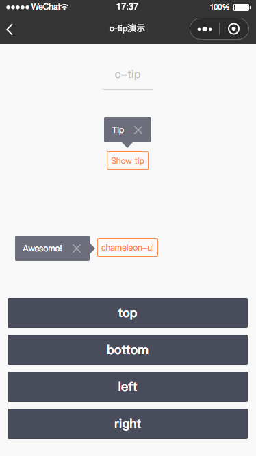
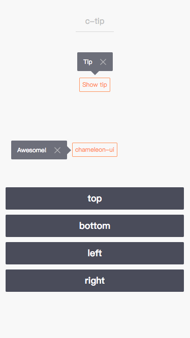
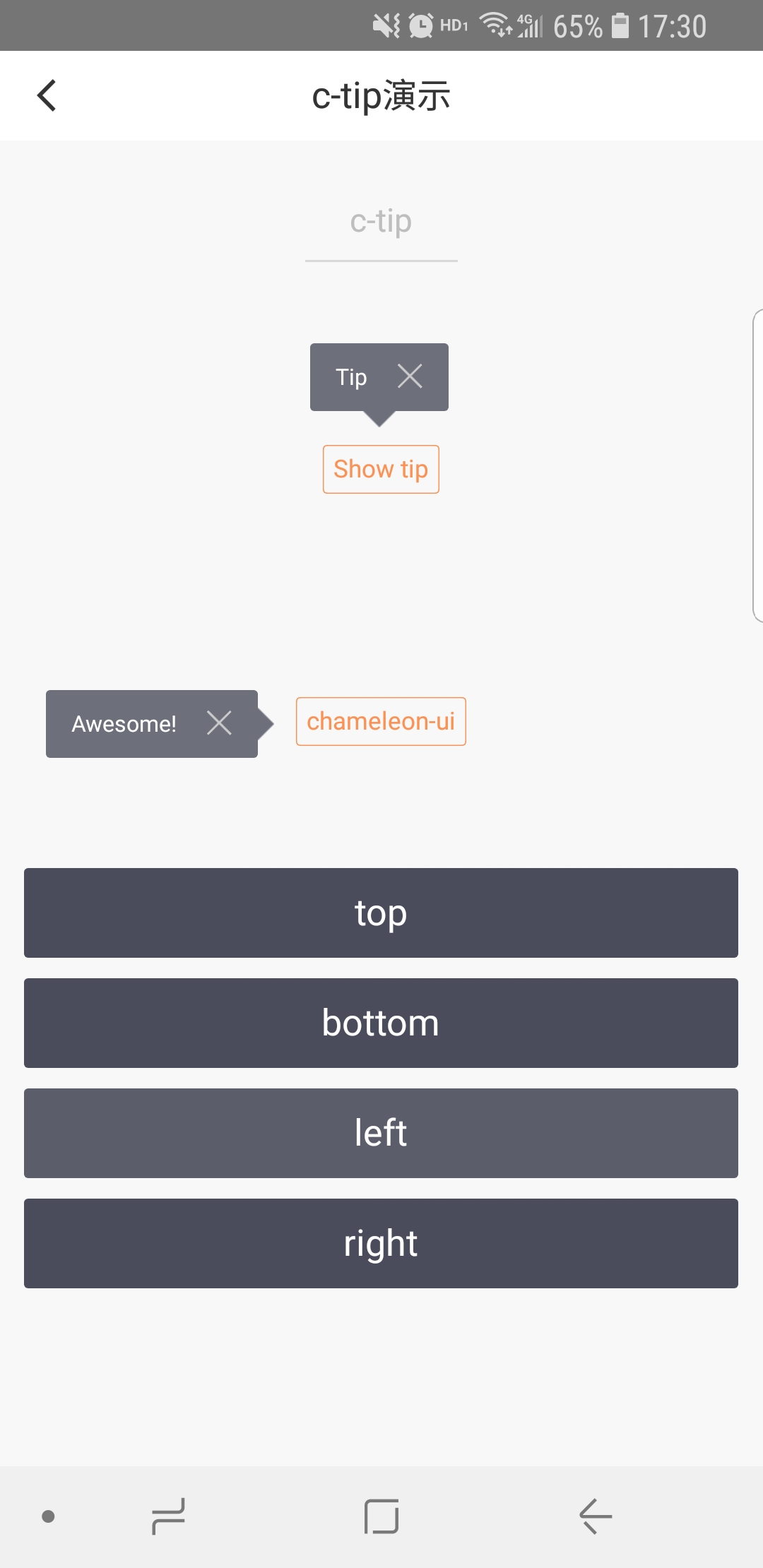
c-tip
提示
属性
| 属性名 | 类型 | 必填 | 默认值 | 说明 |
|---|---|---|---|---|
| show | Boolean | 否 | false | 提示框是否显示 |
| direction | String | 否 | top | 提示框所在位置,可选值top/right/bottom/left |
| offset-left | Number | 否 | 小三角之Tip左边距离 | |
| offset-top | Number | 否 | 小三角之Tip顶部距离 | |
| offset-right | Number | 否 | 小三角之Tip右边距离 | |
| offset-bottom | Number | 否 | 小三角之Tip底部距离 | |
| c-bind:close | EventHandle | 点击关闭按钮触发 |
注意:Tip小三角默认是居中显示的,当direction值为top或bottom时,如果offset-left或offset-right有值且不是NaN,则小三角的距离为传入值
示例
<template>
<view class="container">
  <c-tip show="{{true}}" direction="top" style="position:absolute;top:0;left:0;">
    <text style="font-size: 24cpx;color: #fff">Tip</text>
  </c-tip>

  <c-tip show="{{true}}" direction="left" style="postions: absolute;top: 200cpx;left: 0;">
    <text style="font-size: 24cpx;color: #fff">Awesome!</text>
  </c-tip>
</view>
</template>
<script>
class CTip {
}

export default new CTip();
</script>
<script cml-type="json">
{
  "base": {
      "usingComponents": {
          "c-tip": "cml-ui/components/c-tip/c-tip"
      }
  }
}
</script>