row
横向flex布局容器
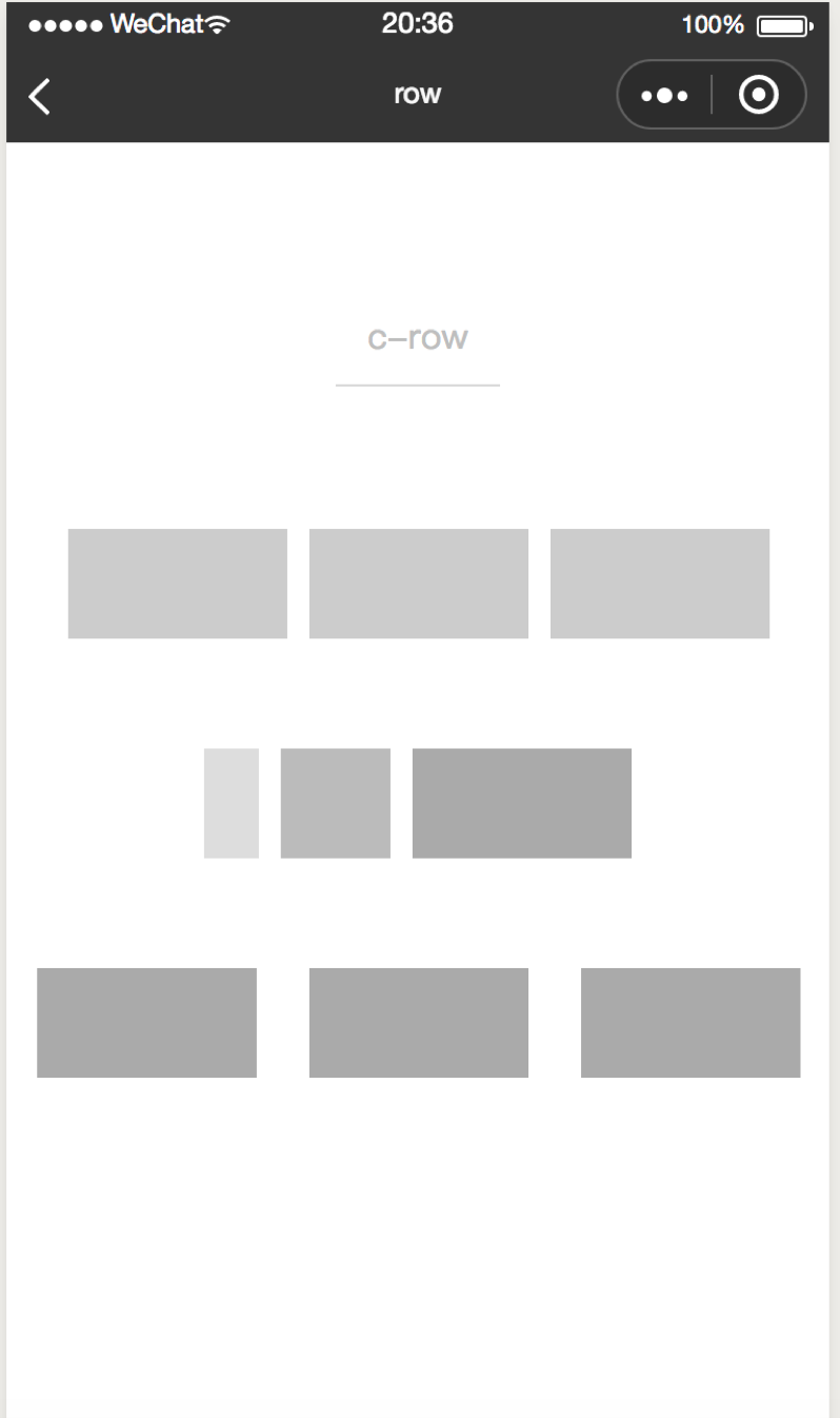
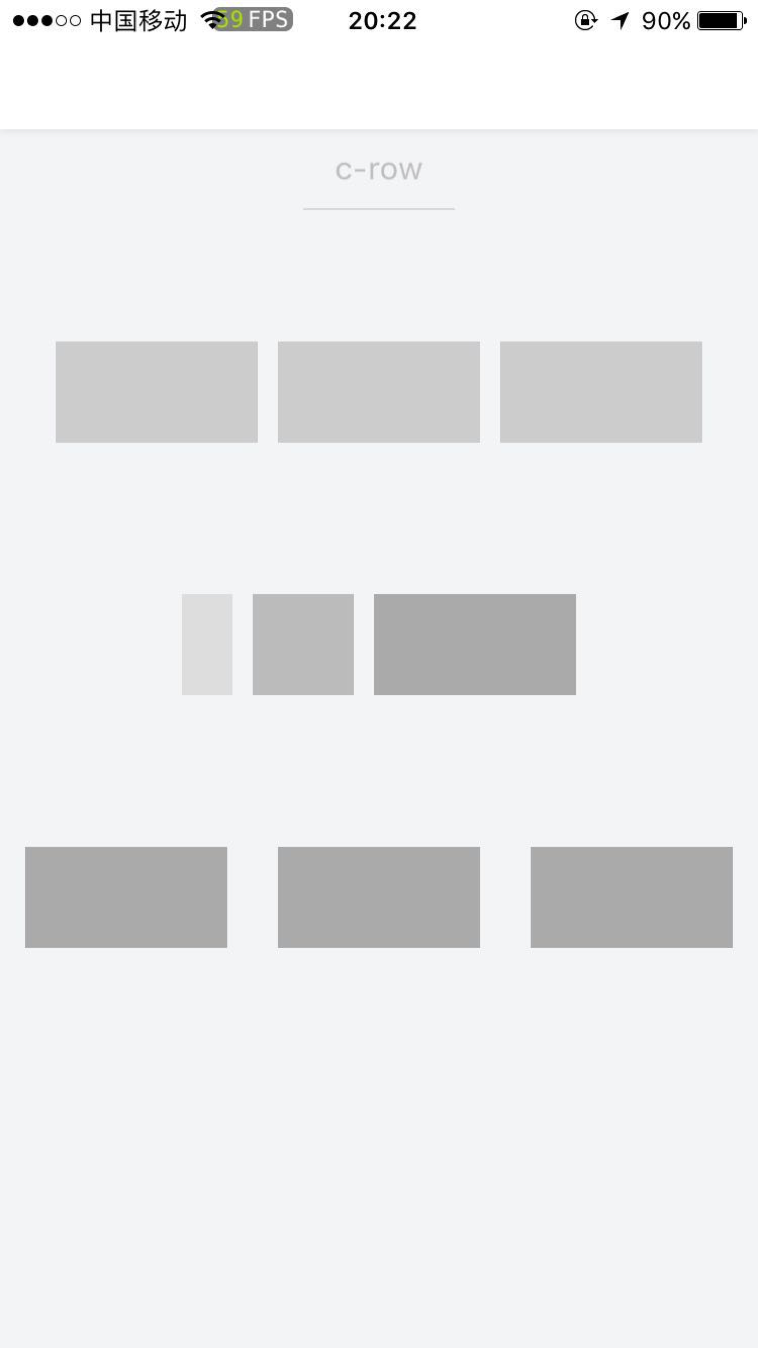
<row>是提供横向flex布局的容器,与 <col>组件(提供纵向flex布局)结合使用,可快速构建整洁干净的flex布局效果。
row属性
| 属性名 | 类型 | 必填 | 默认值 | 说明 |
|---|---|---|---|---|
| justify | String | 否 | center | 横向对齐方式,可选值包括:start/end/center/space-around/space-between |
| align | String | 否 | middle | 纵向对齐方式,可选值包括:top/middle/bottom |
| height | Number | 否 | 0 | 容器高度,值为0时容器高度由内部元素高度决定 |
| wrap | Boolean | 否 | false | 是否支持换行 |
| margin | Number | 否 | 0 | 容器上下间隔(单位cpx) |
示例
<template>
  <row margin="{{100}}" height="{{200}}">
    <col width="{{50}}" height="{{100}}" background-color="#ddd" margin="{{20}}">
      <view></view>
    </col>
    <col  width="{{100}}" height="{{100}}" background-color="#bbb" margin="{{20}}">
      <view></view>
    </col>
    <col  width="{{200}}" height="{{100}}" background-color="#aaa" margin="{{20}}">
      <view></view>
    </col>
  </row>
</template>
<script>

class Row  {
}
export default new Row();
</script>

<script cml-type="json">
{
  "base": {}
}
</script>
Bug & Tip
<row>组件内部不一定要使用<col>组件,可使用任何需要布局的容器或组件。- 如果
<row>组件内部不使用<col>组件,需要自行设置内部的宽高等属性。 - 如果
<row>组件内部使用<col>组件,需要将<col>组件设置为<row>组件的直接子节点。 <row>和<col>组件组合使用类似栅格布局,<row>和<col>组件只能相互嵌套。- 建议使用高度属性设置组件高度,而非使用css控制,否则垂直居中的样式可能会受到影响。